Category Archives: OCA

Horizontal and vertical lines

Produce four examples of horizontal and four of vertical lines avoiding repeating the way each line appears as far as possible.

Vertical lines

Lockers

Lockers

 The straight lines of these lockers immediately stood out from their surroundings at the local cricket club. I took photos from several angles and directions and found this vertical framing to be the most pleasing.

Vertical and horizontal lines-2

Trees along the pavement

 There are quite a few lines going on here. The tree trunks provide fairly stark contrast against the receding lines of the road, pavement and verge.

Vertical and horizontal lines-3

Old window

Whilst there are both horizontal and vertical lines here, the vertical lines dominate with the strong contrast between light and dark areas of the photograph.

Vertical and horizontal lines-4

Belle

 My daughter provides the obvious vertical line in this photograph although there are additional vertical lines courtesy of the gate and tree in the background.

Horizontal lines

Vertical and horizontal lines-5

Through the stairs

Shooting from behind this staircase produced some very strong contrast as the backs were deep in shadow thanks to the light coming from a skylight above.

Vertical and horizontal lines-6

Rafters


I was able to take this shot by climbing on to the top of a stack of hay to get up to the roof (please don’t go trying similar unless you know what your doing, not all hay stacks are created equally!). I deliberately included the light as I wanted a point to capture the eye.

Vertical and horizontal lines-7

Round bale detail

 Lots of lines here, the individual black and white lines form four larger bands. They all serve to draw the eye towards the number 9.

Belle on a bench

Belle on a bench

 Whilst my daughter is clearly star of the show here again, the strong horizontal lines of the bench serve to draw the eye to her here. Ideally I would have been able to add some symmetry by placing her bang in the middle but the bench is a bit rickety. Didn’t want the poor maid getting stabbed by wayward splinters!

To conclude

I had a few restrictions in place when taking the photos for this exercise. All of the locations were fairly compact so, no room for say, a horizon which would be quite an obvious subject for a horizontal line. In addition, I found myself being drawn to subjects with multiple target lines rather than looking for just the one line.

Leave a comment

Filed under OCA, Part two: Elements of design, TAOP

Exercise 16: Multiple points

The aim of this exercise is to create a still life arrangement to experiment with multiple points.

Two things quickly became apparent.

  • Creating a halfway decent still life isn’t quite as easy as it looks

  • I suck at creating them.

I have to confess that I didn’t hugely enjoy this exercise, the still life it seems, just isn’t my thing! I experimented with toys (plenty of those with a toddler) and with with the contents of a kitchen cupboard.

For the set up, I mounted the camera on a tripod pointing towards our dining room table and for lighting I used a hot shoe flash with a black card snoot to create more of a circle of light (not hugely apparent with some baking paper acting as a diffuser as using a bare flash against the table created some nasty blue reflections. May as well get it right in camera rather than spend lots of time post processing..

Multiple points-1 

I’ve more or less plonked this in the middle of the frame as it seems the most natural point to begin with.

Multiple points-2 

In the second photo I’ve added some more sauce and some chilli to create a triangle although the shadow from the big bottle breaks this up slightly.

Multiple points-3

 With another bottle added, the caps of the three bottles now form the points of an inverted triangle.

Multiple points-4

A small spice jar is added to the mix. Rather than add to the group I want to start off a second grouping.

Multiple points-5

In addition to another jar being added, I’ve moved the first group to the right of the frame to create some balance.

Multiple points-6


For the final photo, I’ve added one extra spice jar to which creates a second triangle. I did experiment with extra objects but they were beginning to clutter up the frame somewhat.

Having packed up, I should have removed or moved the jar of chillies added in the second photo as it seems out of place.

Multiple points-7


Finally, I’ve sketched over the final image to show the two triangles created by the objects.


I think for future still life work I’m going to have to either work with much smaller objects or in a bigger space. I did have some limitations here although I don’t want to use that as an excuse for what I perceive at least to be a bit of a rubbish piece of work.

Leave a comment

Filed under OCA, Part two: Elements of design, TAOP

Exercise 15: Positioning a point

Examples of points.

A tree in a landscape

A single animal in a field

A bird or insect against the sky

The sun, moon, or a cloud

Aircraft in flight

A single person

A leaf floating on water

Signs

Strong shadows, or bright spots from a shaft of light

A lit window at night

Lone buildings

Photos chosen for the exercise.

Hatherleigh Silver Band

Hatherleigh Silver Band

This one jumped out at me the moment I saw the sign which had obviously been pinched by someone and chucked in to a flood relief channel. Once I’d got to the overlooking wall in order to be able to shoot from above I composed the photo in such a way as to draw the eye in to the sign from the top left hand corner of the frame.

Litter (original)

Litter

I tried framing the crisp packet centrally for my second photo as framing it in a corner would have introduced different kinds of background (hedge above, tarmac below) which I felt wouldn’t have worked. I find it interesting how that the orientation of the packet with relation to the rest of the frame creates a sense of movement toward the lower right of the frame. I experimented further by cropping the photo to place the crisp packet in the top left producing a more conventional, off centre positioning of the point.

Litter (cropped)

Litter (cropped)

Turning

Turning

 Taken trough the gateway of the field, I positioned the tractor centrally but slightly left offset in order to emphasise the tractors movement and show where its heading. However, in this case of this photo, the direction the tractor also provides movement and cropping as to centrally place the point works too.


Leave a comment

Filed under OCA, Part two: Elements of design, TAOP

Assignment 1: Contrasts

The goal of this first assignment is to identify subjects that best express the extremes of different qualities and take pairs of photographs, which bring out the essential differences. A list is provided from which 8 pairs are to be made plus one photo that demonstrates contrast ‘in one picture’.

The pairs that I used were.

  • Large and small
  • Many and few
  • Transparent and opaque
  • Diagonal and rounded
  • Strong and weak
  • Smooth and rough
  • Straight and curved
  • High and low
  • Black and white

Large and Small

Pretty much from the beginning of this assignment I wanted to use one of my daughters toys for the small object. Just what to use and what to pair it with. I decided on using the toy tractor as part of the pair as its diminutive size could be easily shown by including part of a real tractor in the frame. By placing it in the rear wheel of the large tractor gives a sense of scale that couldn’t be achieved by photographing it against a plain background.

For the large photograph, I wanted to exploit the distortion that a wide angle lens produces when close to a subject in order to make the subject really impose itself and dominate the frame.

Many and Few

I had a few ideas for this but the weather was bad at the time of shooting so instead I decided to improvise with and see what I could come up with for the assignment by using only objects from within the house. Most didn’t work but this pair was the exception. For the many shot, I kept things simple and soon came up with the what I had planned.

‘Few’ required a little extra work, (and eating!). I didn’t just want to replicate the many shot with only a small handful of pistachios on the plate, so instead I used some empty shells to show that there are only a few left rather than just a few on a plate.

Transparent and Opaque

 For the opaque photograph I’ve chosen a window that was once upon a time transparent, but over the course of a good 25 years or so having never being cleaned, it has become opaque. I wanted to show the derelict state of the building so moved back a little to include the ivy that has encroached.

I didn’t take the transparent photo right away after, but eventually returned after failing to make a transparent shot and cleared one of the panes of glass in order to reveal the oak tree in the background. I left a border of dirt behind purposely to show that there is actually glass there.

Diagonal and Rounded

 For the diagonal photograph, I used an old tire with a zig-zag tread as my subject. By using a very tight composition I was able to eliminate any horizontal and vertical lines and concentrate solely on the diagonal tread. I was also pleased with how this photo works with both horizontal and vertical framing.

For the rounded subject I chose a granite sculpture of a bell as it has multiple round elements to it. I feel it does fit the assignment but to me its not a particularly inspiring image. I tried on more than one occasion to find a different subject but failed to do so.

Strong and Weak

 I tried multiple subjects for this pair such as different types of stone, using a large rock for strong and shattered slate stone for weak but I didn’t really think they worked very well in practice. As an alternative I chose some lengths of chain as my strong subject and a tatty, frayed length of rope as my weak. I also chose to convert the final images to black and white as I found that the colour images were quite flat and lacked contrast.

Smooth and Rough

 ‘Skin’ came straight to mind for this pairing. For the smooth skin I chose the pair of apples on a tree and made the shot with a wide aperture to make it appear smoother due to most of the subject being slightly out of focus.

For the rough photo I used the bark on the trunk of the apple tree as its very rough and flaky. I chose to get in close again but use a smaller aperture in order to get most of the bark in focus. I tried quite a few different compositions for the rough shot but chose the close in one due to there being a lot of distracting background elements when shooting from further away. The apparent roughness was also reduced by moving back.

Straight and Curved

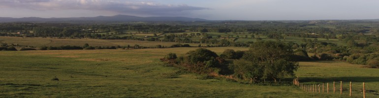
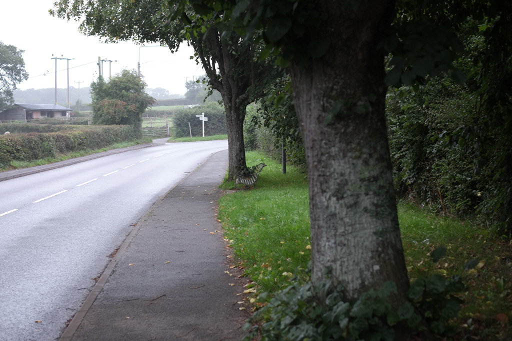
 The shot of the lane that I used for straight popped straight to mind when I saw straight and curved in the list of options. I knew that there would be at least 3 different sets of straight lines in the shot that would work with vertical framing. 1) the pine trees that have very few branches apart from at the top, 2) the tracks and 3) the grassy strip in the middle of the track. As such, it was a pretty easy photo to take, just requiring me to go there on a decent day with good light.

My curved photo I don’t feel is quite as strong, but I wanted to use a track again and have it curve off towards the side of the frame. My original plan was to make the shot with the track closest to the centre of the frame be centred, but upon shooting and checking the results it just didn’t look quite right. So I re-shot with the track slightly offset to the right, away from the direction of the curve.

High and Low

 My original plan for this pair was to shoot a flower and a tree but I’m glad I went with two flowers that are at completely opposite ends of the scale when it comes to height. My aim for the dandelion photo was to emphasise its lack of height by shooting at its level and in reasonably long grass. Another consideration was to make use of a background object that’s much taller to add some perspective.

For the shot of the sunflowers I once again got to ground level and shot using a wide angle lens to get as much height as possible. I did take a photo even closer to one of the sunflowers with a vertical composition, but managed to focus on a leaf near the base rather than the head which ruined the shot. If I get the chance its a shot I’d like to retake. 

Black and White (contrast in one picture)

Black and white

Black and white

 For this shot I made some ice cubes with black coffee and then popped them in to a glass of milk which I then shot on a black background. I used bounced flash to illuminate the scene and converted the shot to black and white to further emphasise the contrast, I also used lightrooms burn tool in order to darken the ice cubes a little further. I’m quite happy with the outcome of the final photo, although it would have been nice to experiment with some more angles as I was limited by having a pretty small background and had to shoot very close due to currently being without a telephoto or macro lens.

Ideally it would have have been nice to have been able to use off camera lighting, something I’m planning on learning to use in the near future.

Reflections

I’ve already noticed some small changes to the way I see and photograph since starting this course. Some old habits die hard however, and I think I still need to take that little bit of extra time when shooting to make sure that I really capture what I plan to.

If I was to shoot the assignment a second time round I’d aim to pick a theme and shoot around that rather than what I have done as I think it would produce a far more coherent body of work.

Leave a comment

Filed under OCA, Part one: The Frame, TAOP

Exercise 14: Cropping

Cropping gives us a means of altering the composition of an image after it has been taken. In this exercise, the aim is to pick 3 previously taken photos and produce a new composition through cropping.

Welding: This is a photo taken back in 2009 with my old canon 350d and if I remember correctly I’d just picked up my first ever fast lens and was eager to play with the new toy. I didn’t really know what I was doing at the time and just aimed dead centre at from a little way back and took practically the same photo several times over. Lots of dead space and some distracting light around the edges of the door frame. They’ve just sat on the hard drive since forgotten until now.

I experimented with a square crop with the subject in the centre to start with but I found the composition to be quite boring. Going back to the original ratio, I cropped to roughly the height of the door and left a good deal of empty space to the right of the frame. I feel that with the subject positioned on the left, the eye takes a fairly natural path across the photo and given the constraints of the original photo, I’m pretty happy with the results.

Baboon:

A snapshot from my daughter’s first time at the zoo here. The baboon was walking from right to left but the central composition doesn’t really convey any much in the way of movement. By cropping away most of the background and positioning the baboon on the right there’s more of a sense of movement in the cropped version

Madeira Airport:

This photo is from our holiday back in October 2010. We were on a viewpoint looking over the airport. The original was taken to fit all of the visible airport in to the frame but a result is that there is quite a bit of rather boring empty space above and below. With a 1:3 ratio panoramic crop, the result is more pleasing with the runway dividing the frame and providing a natural line for the eye to follow. 

A few notes:

As demonstrated, cropping is a powerful that can be used to completely change a photograph if required. It can also be used remedially to correct for compositional errors although that’s obviously we should aim to avoid that situation.

Leave a comment

Filed under OCA, Part one: The Frame, TAOP

Exercise 13: Vertical and horizontal frames

This requirement for this exercise is to find and photograph scenes suited to a vertical frame and then to return and shoot the same scene horizontally. I actually misread the brief and went out and took photos of each scene horizontally first and then vertically. I did, however choose scenes that I thought would be suited to vertical framing. Alos, please note I’ve not included the full 20 pairs of photos in this post.

Pair 1, Fungi: Shot vertically, this scene gives a good sense of depth and height. I think the eye also follows quite a natural path from the further away fungus to that in the foreground.

Pairs 2-5, workshop: For this set, shot in a farm workshop, vertical compositions are far better suited as the tighter framing isolates most subjects from their surroundings which in this case are very busy. I deliberately chose this location as I thought it could provide some interesting subjects.

Pair 6, Turner: Vertical framing for this subject gives a more accurate representation of its size in addition to showing some extra detail.

Pair 7, Sunflower: If you want to emphasise the height of a tall subject such as this sunflower, then using a vertical composition and shooting from below helps allows the subjects height to be shown more effectively than shooting the same scene horizontally.

As expected, I do tend to take most of my photographs with horizontal framing. When looking for vertical compositions I found myself looking for height, depth and scenes where a tighter composition was favourable.

Leave a comment

Filed under OCA, Part one: The Frame, TAOP

Exercise 12: Positioning the horizon

Firstly, I went out to take these simply when I could grab the time rather than wait for the best conditions. It turned out to be right around the end of the day and the light was failing fast. Still, there was enough for the purpose of this exercise.

Secondly, I rushed (remember about the rapidly failing light I mentioned?) and rather than set the exposure manually as I normally would for landscapes, I left the camera on aperture priority mode. As such, it metered differently for each photo taken. Shooting raw saved my butt with regards to the varying exposures and converting to black and white was the remedial action required for the rubbish light.

For the location, I went up to Hatherleigh moor and looked out towards Dartmoor as the horizon is about 10 miles distant and pretty unbroken.

Very low horizon

Very low horizon

Doesn’t work that well as its more or less all sky. Little foreground interest.

A slightly higher horizon

A slightly higher horizon

Horizon positioned to include the line of trees in the foreground. Still not massively interesting although there is some added interest as the landscape is is beginning to gain some depth.

Horizon a third of the way up

Horizon a third of the way up

With the horizon positioned along the line of the bottom third of of the frame, we now have the addition of a fence providing some foreground interest and a convenient line to draw the eye across the frame. This one works.

Horizon centrally positioned

Horizon centrally positioned

Not such an interesting composition as the one before as the extra foreground doesn’t add anything to the frame.

Horizon higher still..

Horizon higher still..

Not a lot to mention here except for the fact its beginning to add some slightly distracting elements to the bottom of the frame.

Horizon in top sixth of the frame

Horizon in top sixth of the frame

Things have gone really wrong now with the top of the hedge being added to the foreground. Its addition grabs immediate attention and draws the eye immediately away from the rest of the frame.

To summarize things..

As demonstrated by the photos taken for this exercise, positioning the horizon is a case of striking up the right balance when it comes to landscapes. Too low and you can end up with no interesting foreground detail and too high and you risk adding either unnecessary foreground details. In the case of this scene having the foreground occupy the bottom third of the frame worked the best.


Leave a comment

Filed under OCA, Part one: The Frame, TAOP

Exercise 11: Balance

This required me to look back through my previously taken photos and look for balance, be it objects, colour or tone etc. I’ve selected half a dozen photos spanning from around the time I first got a dslr right up until this year.

sox

Sox - Scales

Sox – Scales

The first photo is of the old family pet cat, Sox, taken on a sunny day in 2007. The greenhouse on the left and the wall on the right balance each other.

Trouble

Trouble

Trouble – Scales

Although the pig sits slightly over the centre of the photo, its balanced by the large dark area on the left hand side of the frame. Trouble you ask? Trouble because this pig and the rest of its siblings were constantly on the lookout for ways to escape. The gate was even jumped/climbed over on a couple of occasions. Trouble indeed!

Funchal

Funchal

9320scales

Fuchal – Scales

This photo was taken on our first night on holiday in Madeira in 2010. The large building is balanced by the part of the building in the lower left of the frame as well as the trees.

Diamond Jubilee beacon - Hatherleigh

Diamond Jubilee beacon – Hatherleigh

jubilee_scales

Jubilee – Scales

I remember seeing the two people in the middle of the frame having a chat and thought it would look good right away. I deliberately moved to a point where I’d fit in the two groups either side. One of my favorite photos taken on the day out of several hundred. Its not perfectly balanced but pretty close.

Sheep on the moor

Sheep on the moor


Sheep - Scales

Sheep – Scales


I knew exactly what I was after when taking this photo, the sheep ‘sandwiched’ between the dark ground and cloud with the lighter sky in the background.  To take the photo, I had to work my way around a the sheep that was stood on the crest of a hillock. I was pretty lucky to get the shot as there someone had just come through a gate with their dogs. The sheep was checking them out just prior to moving off. With the sheep centered, the three horizontal bands ensure balance.

Swallows

Swallows

I deliberately chose this photo as I feel it has elements of balance although I don’t feel they work particularly well with the scales. The line running diagonally through the frame essentially in to two balanced haves although the trees only covering 3 quarters of the bottom of the frame through it off a little. If retaking the photo, I’d at least try to alter the composition to include trees entirely along the bottom or none at all.

This exercise has highlighted to me that I’m taking lots of photos using unequal objects to create balance but very few if any using symmetry. I’m planning on taking this and looking for new photo opportunities where previously I may not have seen them.

Leave a comment

Filed under OCA, Part one: The Frame, TAOP, Uncategorized

Exercise 10: Focal lengths and different viewpoints.

This exercise calls for two photographs of the same subject to be taken at telephoto and wide angle views, ideally with as as much difference between the two focal lengths as possible. The subject should fill the frame in each instance.

With this in mind, I set out to take  one photo at 200mm and one at 28mm. I chose an upturned tree stump in some local woods as my subject.

200mm

200mm

2833

28mm

The difference between 200mm shots are dramatic. At 200m the the features of the stump are compressed resulting in quite a flat image, this compression is also makes the tree in the background appear closer than it is. At 28mm any compression of the subject is long gone and the stumps almost begins to take on a 3 dimensional appearance.

Even though the framing of the stump is similar, the much wider field of view of the 28mm lens, shows off the subject in its surroundings whereas at 200mm the subject is well isolated.

Leave a comment

Filed under OCA, Part one: The Frame, TAOP, Uncategorized

Exercise 9: Focal lengths

The object of this exercise is to demonstrate the affect on the angle of view that changing lenses from one focal length to another has. For this exercise I used my 28mm and 70-200mm lens and shot all the photos at f/4. I recently sold my 50mm as I wasn’t getting on with it very well, so I’ve got quite a gap in between 28 and 70mm. I’m hoping to fill that whilst I save up to fill the gap by using an adapted Olympus 50mm f/1.8 that normally lives on my OM2. I didn’t get around to using it for this exercise however.

This exercise demonstrates how increasing the focal length increases the magnification (and level of detail on the subject recorded), although at the expense of the field of view. A similar result can be had from cropping a wide angle although this have negative effects on the final image size for printing etc if very heavy cropping is required.

Leave a comment

Filed under OCA, Part one: The Frame, TAOP, Uncategorized